Interactive Insights Dashboard
A change-over-time dashboard built by consolidating two legacy Terakeet tools, Presidio and Chorus, into one holistic view of brand favorability and search result performance, driven by usability testing and stakeholder focus group insights.
- Team
- Senior UX Designer (me), 4 stakeholder power-users, a product manager, 3 developers
- Methods
- Usability testing, Stakeholder synthesis, Iterative prototyping, Interaction design
- Tools
- Figma, Condens
Overview
I was the first designer to work on Presidio, Terakeet's internal tool for tracking search engine results page (SERP) changes and topic movement over time, and its companion tool, Chorus, which tracked the favorability of SERP results and overall brand perception. An 11-participant usability study and stakeholder focus groups informed three rounds of iteration, resulting in a consolidated interactive dashboard that unified legacy data sources and increased product adoption.
- Account teams using the dashboard for client reporting
- 4 → 12Account teams using the dashboard for client reporting
- Reporting time reclaimed per team, per year
- 18 daysReporting time reclaimed per team, per year
- Usability study participants
- 11Usability study participants
The Problem
Presidio is an internal tool used by SEO analysts at Terakeet to track SERP changes and topic movement for client queries. Chorus, a second tool, focused on tracking favorability over time. Together, they helped analysts report changes back to clients to showcase the impact of content, UX, and SEO strategies on search results. However, both tools were legacy products with dated interfaces and fragmented workflows, so analysts used them only when necessary rather than incorporating them into day-to-day work.
How might we understand how Presidio and Chorus were actually being used in people's current workflows, and identify optimization opportunities, in order to increase adoption by removing barriers to entry, improving efficiency, and consolidating both tools into one that clearly demonstrated its value?
Goals
- Increase adoption of Presidio among the delivery teams and analysts who were supposed to be using it day to day.
- Deprecate Chorus entirely by folding its two core jobs, tracking favorability over time and tracking the favorability of SERP results, directly into Presidio.
- Give teams a single consolidated view of favorability and search performance, instead of switching between two separate tools to get the full picture.
Research: What Was Actually Blocking Adoption
I started by understanding what existed today: how each tool worked and how people actually used it. From there, I ran a mixed-method study: a background survey plus task-based usability testing with 11 participants across the roles who touch Presidio day to day (technical SEO analysts, SEO managers, an SEO director, an account manager, and an SVP of Branded Search). Tasks covered logging in, reading and filtering SERP results, creating tracked topics, and comparing results across dates.
Usability findings
- Historical reporting, the single most-cited pain point, required manually flipping between two separate date views with no way to see change over time in one place.
- 8 of 11 participants missed the scope filter (All / Top 100 / Top 10) entirely; it was too easy to overlook, not too hard to use.
- Recurring confusion between "tracked" and "discovered" topics, worsened when the same topic title appeared in both lists with no way to tell them apart at a glance.
- Participants didn't know what terms to include when creating a topic, and had no way to edit or remove a topic's terms after the fact.
The bigger finding
The "power" users of Presidio were not actually using the tool regularly. While there were missing features and usability issues, the core adoption blocker was overlap between Presidio and Chorus: getting a full picture meant switching between tools, flipping between dates, pulling percentages one at a time, and manually building spreadsheets or dashboards to see trends.
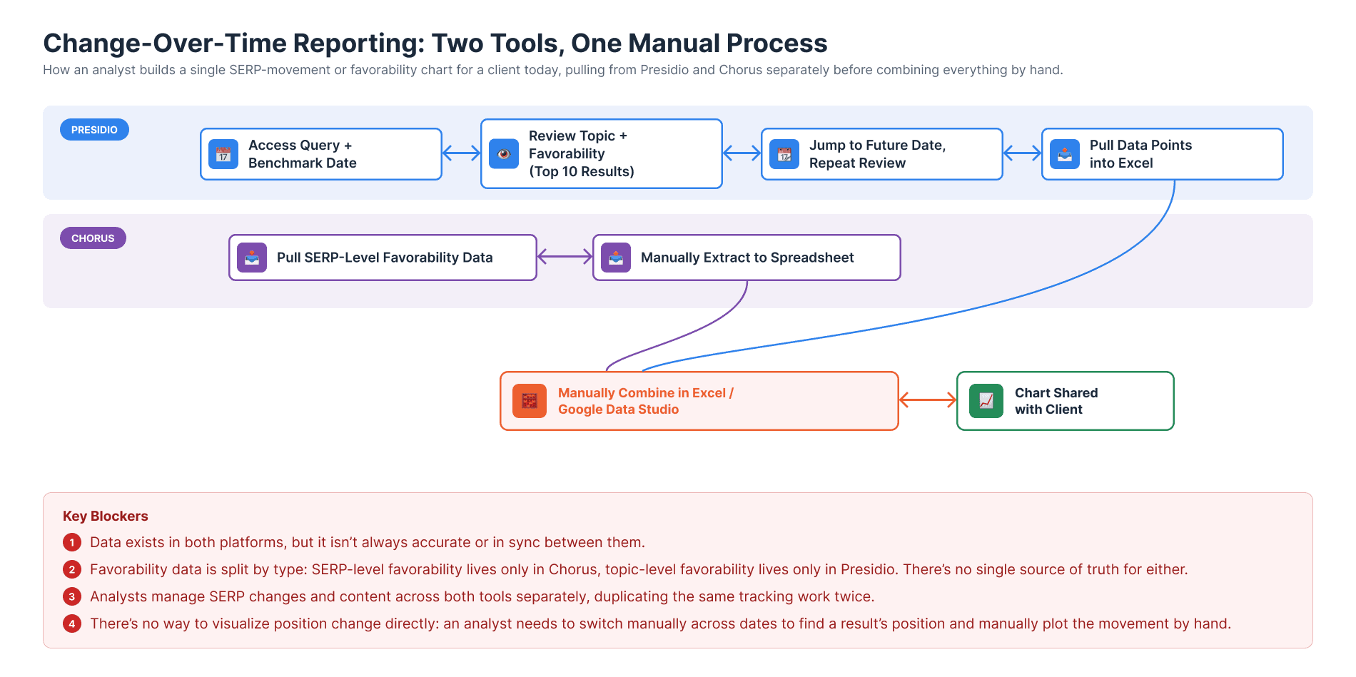
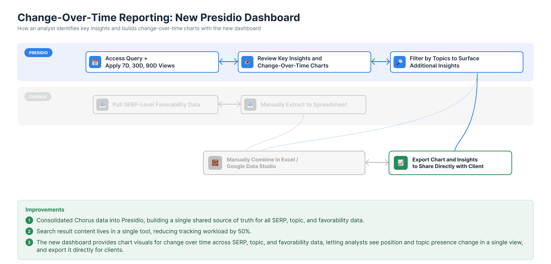
Instead of tackling the smaller fixes, which would only slowly move the needle but not solve the bigger problems, the product team aligned on a clear new direction: reduce manual work, eliminate data overlap, and create a single, holistic view combining data from Chorus and Presidio into one tool.
From Sketches to a Direction
I ran three rounds of design iteration, each stakeholder-tested with the four power users who lead Terakeet's largest client accounts. Early rounds explored different ways to show favorability, topic presence, and search performance together without splitting into three separate reports.
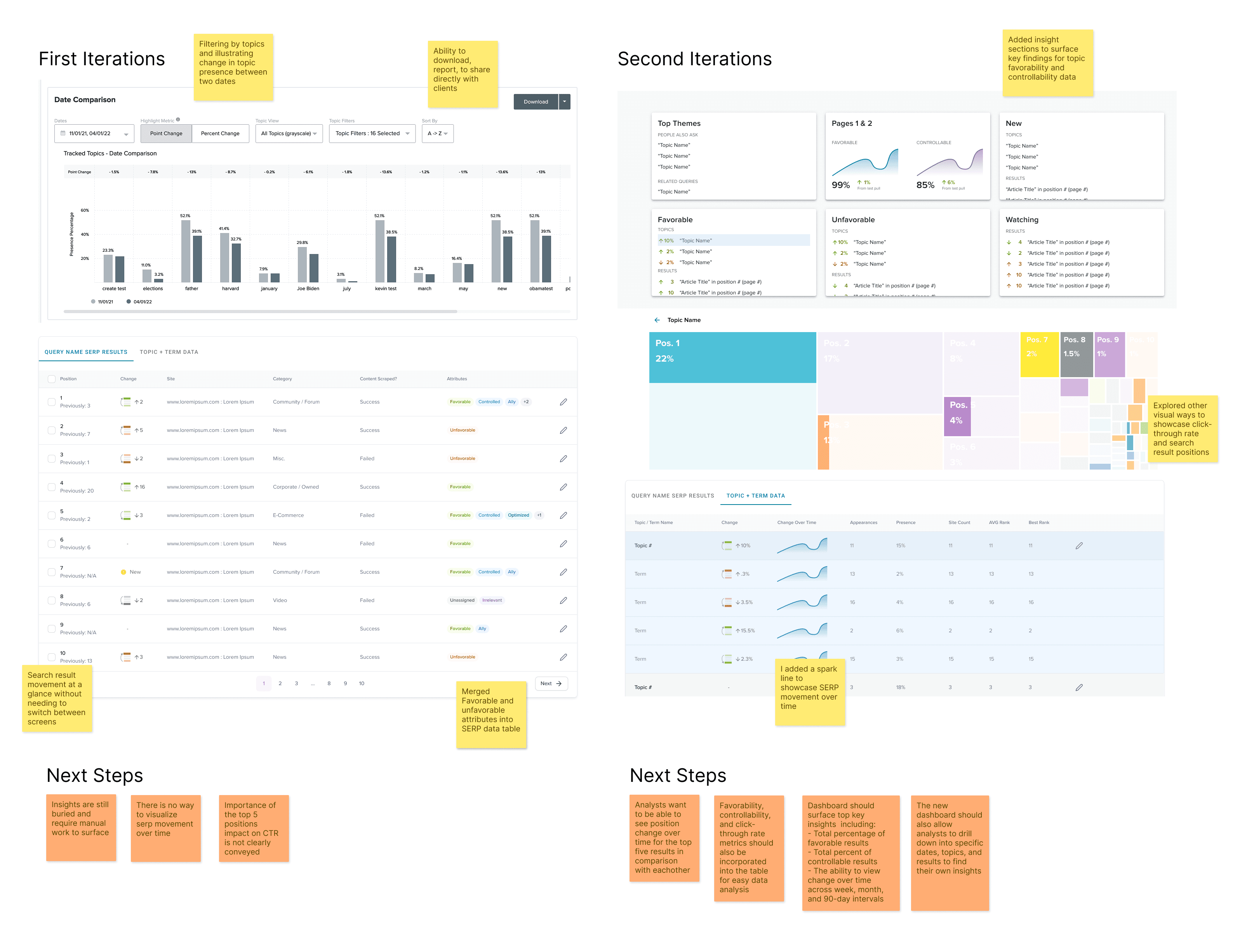
These two rounds surfaced the findings and next steps that shaped the final design:
- The heatmap in round two tested as confusing, so I moved to a simpler bar chart.
- Topic filters needed to support drilling into a single result or topic to see its own insights and data.
- A Key Insights panel written in plain, copyable text for client reports and quarterly business reviews.
- A position-change view showing how a result moved relative to every other result on the page.
The Final Dashboard
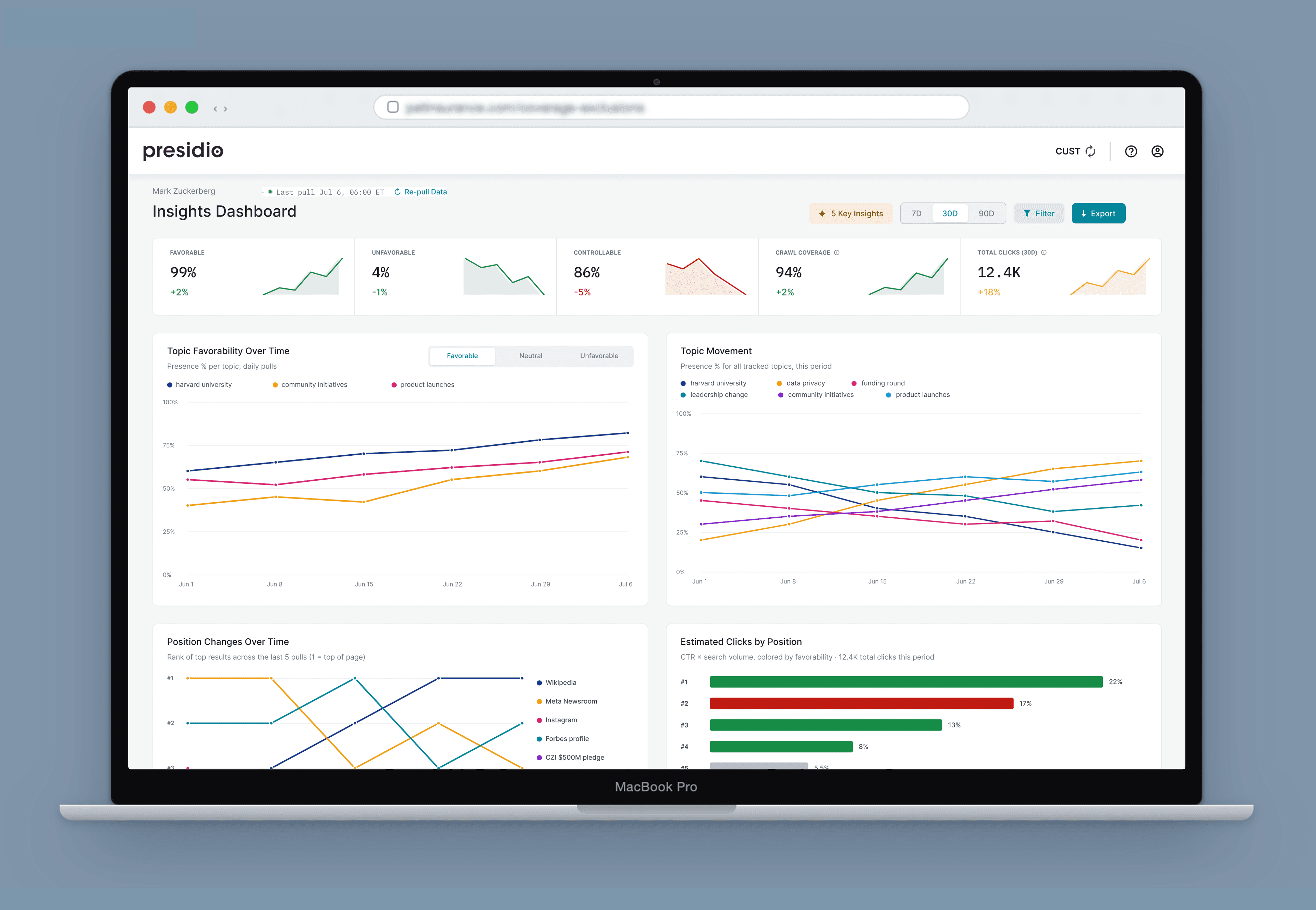
The final design consolidates everything into five pieces of surface area: a KPI strip, a topic favorability trend chart with a favorable/neutral/unfavorable toggle, a topic movement chart, a position-change-over-time chart, an estimated-clicks-by-position chart, and a SERP results table with controllability called out per result.
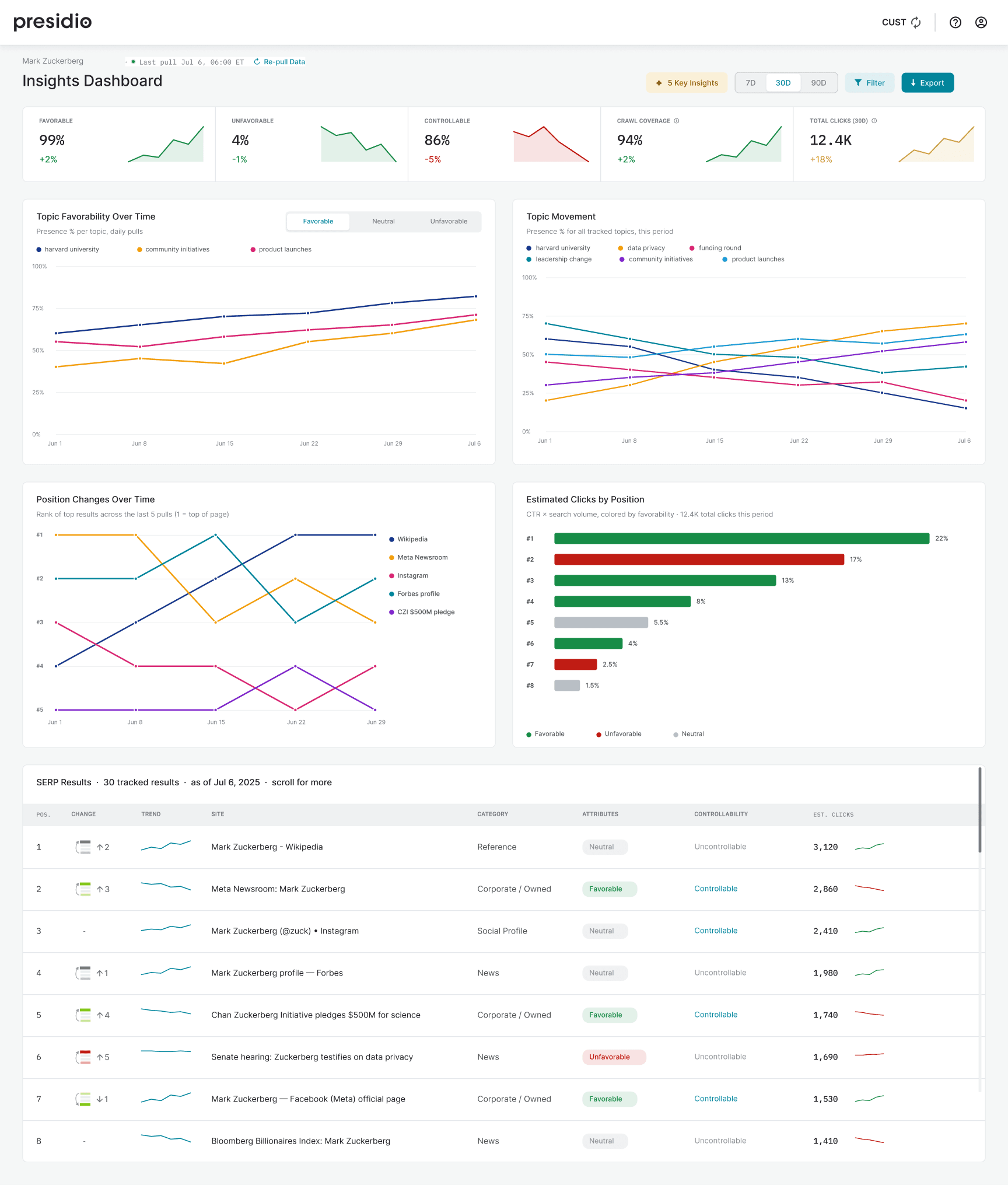
- Scope and date-range controls (7D / 30D / 90D) stay visible, directly answering the finding that 8 of 11 participants missed the scope filter.
- A Favorable / Neutral / Unfavorable toggle replaces three checks people used to do separately.
- Estimated clicks by position gives the dashboard a concrete answer to "why does this matter," the value story the research flagged as missing.
- A "Key Insights" panel surfaces five client-ready takeaways in plain language, pulled straight from the data on screen.
Leading Under Constraints
Chorus and Presidio were internal tools with no client pushing for change and no direct revenue tie, which meant a limited budget for engineering, tools, and research:
- Kept research small and targeted: internal employees via existing incentive platforms, prioritizing our largest client teams and power users over a broad quantitative study.
- Used focus groups instead of one-on-ones, with individual tasks before group discussion, to get both independent and group input without group bias.
- Included PMs and engineers in every research session, recorded them, and built a Condens repository so findings and rationale were visible across the team.
- Used rapid prototypes to get concrete feedback fast, rather than debating directions in the abstract.
- Got buy-in to deprecate Chorus, the project's highest-risk call, by presenting the case directly to our CTO and Product Director and phasing the rollout around a data engineering investment.
Outcomes & Impact
The dashboard launched in phases, starting with Presidio data and later incorporating Chorus data as the original platform was slowly deprecated. Three months after launch, the outcomes included:
- Adoption grew from 4 to 12 account teams using the dashboard for client reporting.
- An estimated 3 hours of reporting time reclaimed per team each week, about 18 days a year, by removing manual cross-tool work.
- Leadership alignment to deprecate Chorus and fold its favorability tracking into Presidio.
Reflections
The biggest lesson was how different the actual blocker, data fragmentation across tools, was from what the usability issues alone suggested. Fixing those in isolation would have made Presidio marginally easier to use, but wouldn't have addressed why "power" users weren't adopting it. I initially assumed usability was the problem and jumped straight into testing, only to find the tool was mostly usable: it simply didn't support their real use case, tracking how SERP and favorability topics changed over time. Building internal tools also meant working within a tighter research budget and limited participant availability, and partnering closely with product management rather than treating their view of product-market fit as the final word. That broader discovery, understanding why people weren't using the tools, what was blocking them, and what their actual workflows looked like, is what ultimately surfaced the real problem.