Pet Insurance Cost Calculator
Reimagined how prospective customers estimate pet insurance cost, creating clear value and clarity on coverage leading to more confident decisions.
- Team
- Lead UX Researcher & Designer (me), 1 UX Designer, 1 Visual Designer, 1 Content Specialist, 3 engineers, and the client team
- Methods
- Stakeholder interviews, Generative research, Prototyping, Usability testing, Impressions testing
- Timeline
- Q3–Q4 2024
- Tools
- Figma, Condens, Respondent
Overview
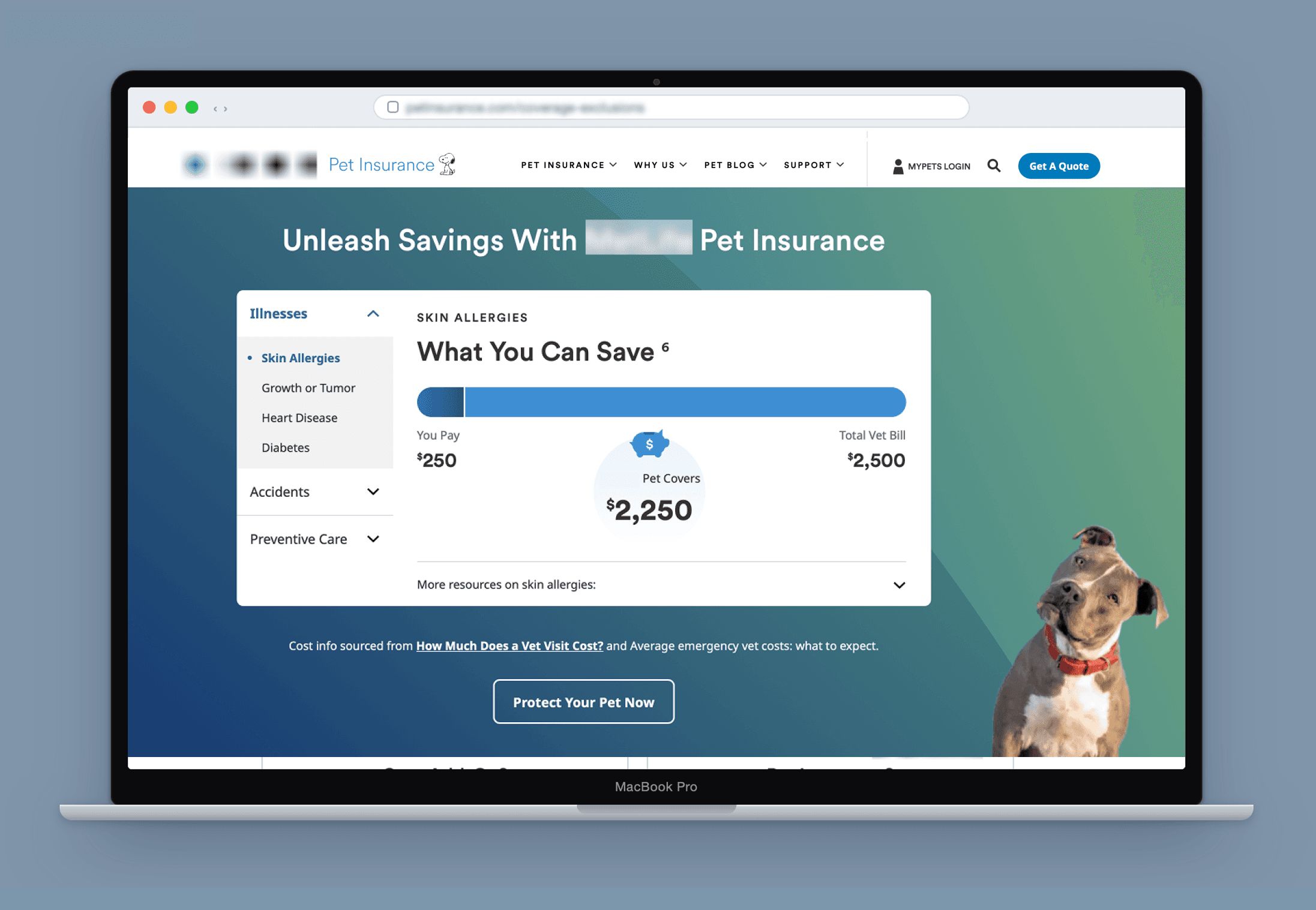
Prospective customers weren't converting because they couldn't tell whether pet insurance was worth the cost. I led research and design to turn that insight into an interactive cost calculator that reframed the decision around real, tangible savings instead of abstract premiums.
In a 30‑day pre/post test across four product pages (Coverage & Exclusions, Dog Insurance, Cat Insurance, and Is Pet Insurance Worth It), the new component collapsed multiple decision steps into a single interactive experience and added a direct entry point to the quote form. This shortened the path to the first meaningful action of starting a quote and increased quote starts by 47% (from 337 to 713 in 30 days).
- Quote starts
- +47%Quote starts
- Quote completes
- +9%Quote completes
- Product pages adopted
- 4Product pages adopted
The Problem
Previous generative research had already surfaced the core tension: prospective customers understood that pet insurance existed, but many couldn't say with confidence whether the benefits actually justified the expense. That uncertainty was the main blocker for conversions. Competitors in the space had already built tools and visuals to showcase clear value and our client wanted to be more competitive.
How might we make the value of coverage transparent enough, and compelling enough, that prospective customers could resolve the cost-versus-benefit question themselves before they ever started a quote?
Process & Research
I opened with a competitive review of how other pet insurers were solving this same problem, to see what worked, what didn't, and where there was room to differentiate. From there, I ran several rounds of design exploration: testing directions that illustrated savings for specific, common conditions, appealed differently to cat vs. dog owners, and used progressive disclosure to avoid overwhelming users with every stat at once.
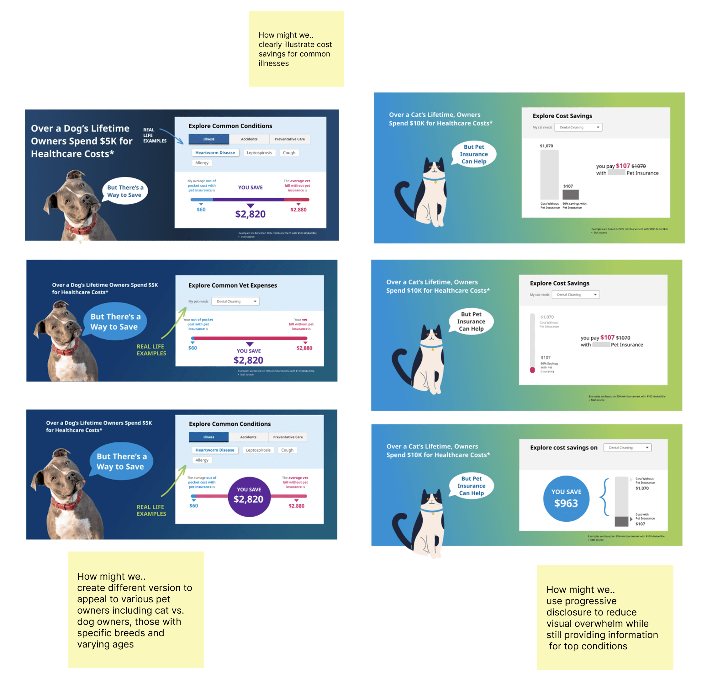
Each of these early frames tests a different way to make a savings number feel concrete rather than abstract: naming a specific condition, splitting the framing by pet type, or hiding secondary detail with progressive disclosure. Reviewing these side by side with the team narrowed a wide field of ideas down to two finalized directions with distinct visuals and copy.
Version A anchored on a single high-cost condition, dental cleaning, with a dropdown to swap in other conditions. Version B organized costs into illness, accident, and preventive-care categories, navigated with tabs and pill filters. To decide between them, I designed and moderated a first-impressions and preference test with 5 participants. Each participant viewed the static design for 30 seconds then answered questions about purpose, first action, takeaways from the visual. Then they were shown both prototypes and answered a few more structured questions about purpose and preference.
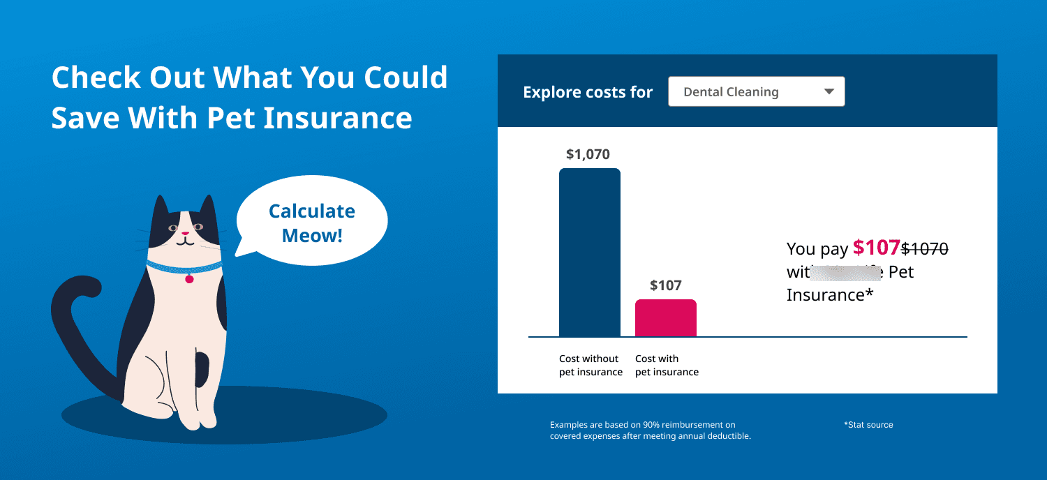
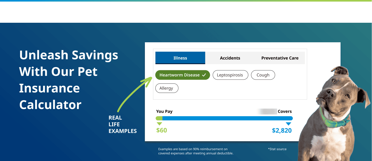
- 4 of 5 participants preferred Version B
- Both versions clearly communicated the calculator's purpose at a glance
- Version B's category pills and tabs invited more interaction than Version A's single dropdown
- Leading with "savings" instead of "cost" resonated strongly with participants
- Version A's graphic tested as dated, and its single dental-cleaning example felt too narrow
The two short prototypes below were shown to participants. Both with the same savings-forward framing, tailored per pet type.
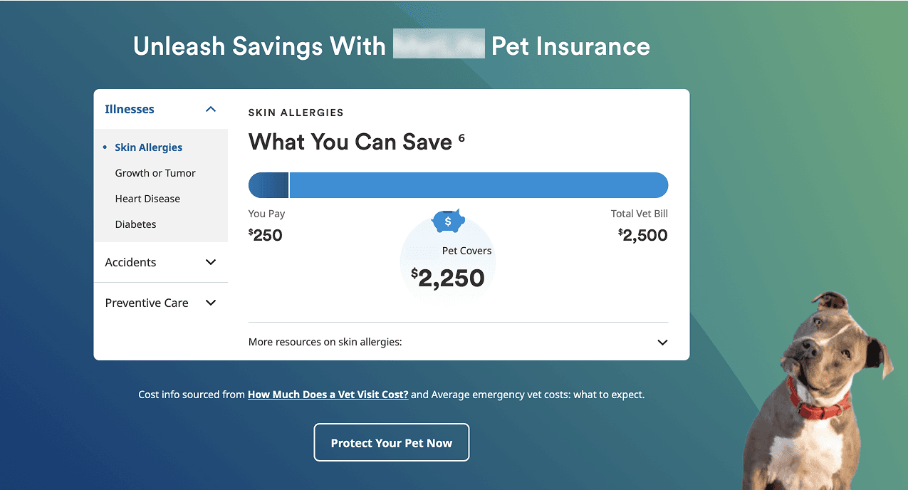
I worked closely with the visual and UX designers to translate the testing feedback into this final, refined component with polished visuals, a left-side navigation pattern, and improved interactions to align with the current design system.
How I Influenced the Team
Research only changes decisions if the people making them see it firsthand. I brought stakeholders, engineers, and designers into research sessions whenever their schedules allowed, and shared full session recordings with anyone who couldn't attend live, so the findings landed as direct evidence, not a secondhand summary. Rather than push for a full launch off a 5-person impressions test, I recommended we ship the component behind a pre/post test focused specifically on quote-start lift, giving the client a lower-risk path to validate the decision with real traffic before committing to a wider rollout.
Outcomes & Impact
The final version was launched as a 30-day pre/post test live across four product pages — Coverage & Exclusions, Dog Insurance, Cat Insurance, and Is Pet Insurance Worth It — and was then adopted as a permanent, reusable pattern across all four.
- Quote start rate up 47% (337 → 713 in 30 days) during the pre/post test
- Quote completes up 9% overall
- Rolled out to 4 product pages: Coverage & Exclusions, Dog Insurance, Cat Insurance, and Is Pet Insurance Worth It