Healthcare Navigation Redesign
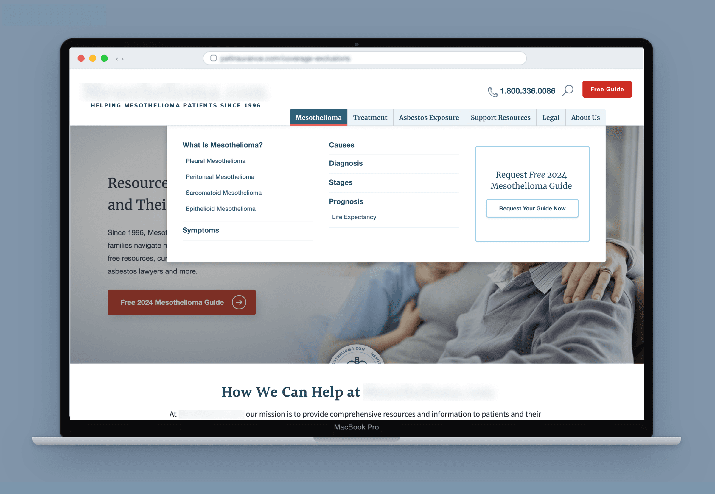
Rebuilt a sprawling site navigation to surface support content that had been buried in the menu, to improve findability of content for mesothelioma caregivers and patients as well as search engines.
- Team
- Lead UX Researcher (me), 1 UX Designer, and a cross-functional team spanning content, technical SEO, PM, and CSM on a challenging client account
- Methods
- Stakeholder alignment, Moderated card sort, Unmoderated card sort, Usability testing, Pre/post analysis
- Timeline
- Q1–Q3 2025
- Tools
- Figma, Optimal Workshop, Condens, Respondent, Google Analytics
Overview
A redesigned information architecture cut secondary navigation items by 47%, lifted click-through to support resources by 4.5%, and cut bounce rate by 16.7%, all while improving the site's search performance. The client's navigation had grown to 7 primary and 57 secondary items, burying the support content that mesothelioma patients and caregivers came to the site to find. I led a mixed-methods study, pairing moderated interviews and a card sort with an unmoderated card sort across 40 participants, to uncover users' mental models and then redesigned the site's information architecture to support improved findability of key content.
- Secondary nav items
- -47%Secondary nav items
- CTR to support resources
- +4.5%CTR to support resources
- Bounce rate
- -16.7%Bounce rate
The Problem
Both users and internal employees described the same struggle: they couldn't find what they were looking for, especially the support content for patients and caregivers navigating a mesothelioma diagnosis. That content existed on the site, but it was buried several levels deep in a structure organized around internal categories rather than how people actually thought about Mesothelioma. The findability issues were evident in low traffic to key support pages and high exit and bounce rates on top level pages designed to bring people to more detailed content.
How might we restructure the navigation around how people affected by mesothelioma actually think about their journey, so the support they came for was never more than a click or two away, without disrupting the organic search traffic the site depended on?
Process & Research
The client was known internally for being skeptical of site changes and slow to approve them, so I focused on relationship building and having clear data to back up all decisions. Before designing the study, I ran alignment meetings with the client to understand their budget and tolerance for change, and to walk through what card sorting and interviews could and couldn't tell us, so nobody was surprised by the method or the findings later.
I designed a mixed-methods study: moderated interviews paired with a moderated card sort for 6 participants, plus an unmoderated card sort for 34 more, to balance the depth of qualitative conversation against a sample large enough to be quantitatively credible. Recruiting people with a direct connection to mesothelioma proved difficult, so the study widened to caregivers and patients across cancer types more broadly, on the assumption, validated in the interviews, that the information-seeking journey was similar enough to still be useful. I also coached a mid-level UX researcher I was working with on how to ask non-leading follow up questions, we switched off leading/note taking on the moderated sessions while she ran a share of the unmoderated study independently.
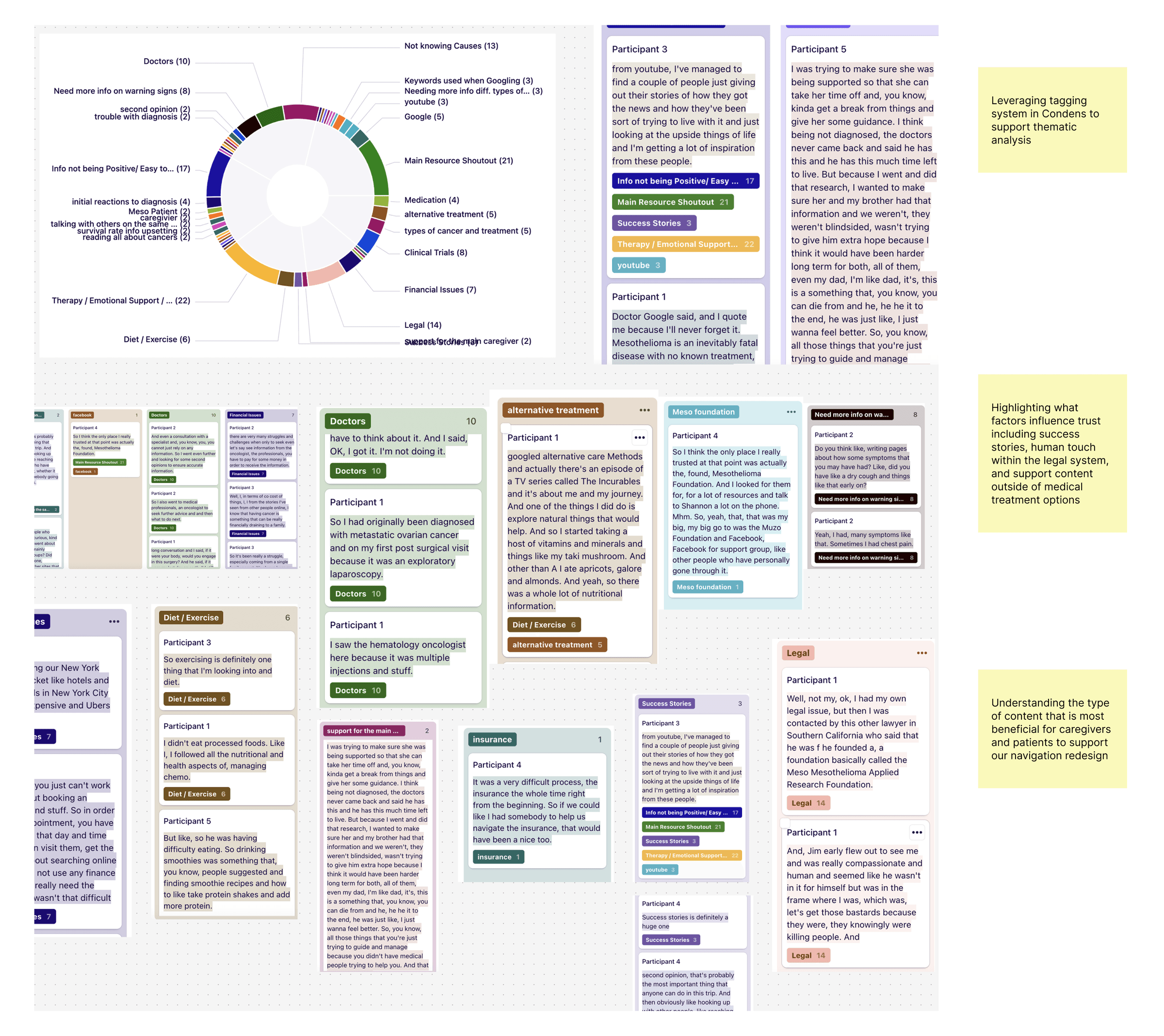
“Doctor Google said, and I quote me because I'll never forget it, mesothelioma is an inevitably fatal disease with no known treatment.”
— Study participant, generative interview
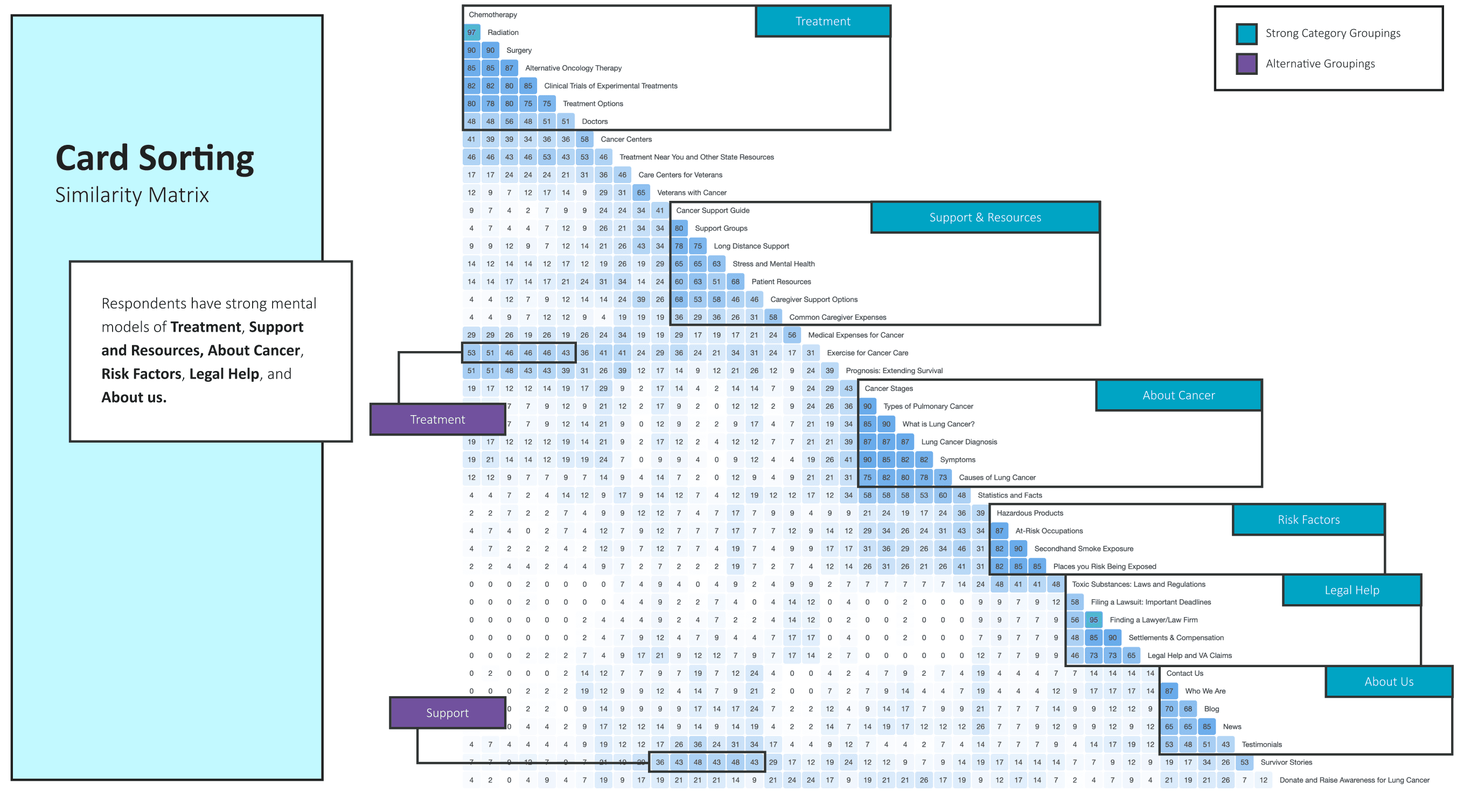
Because the site's traffic depended heavily on organic search, I worked closely with the technical SEO and content teams throughout, checking every proposed structural change against which pages were actually driving traffic from Google. I also ran a competitive analysis, since the client tracked their top competitor closely and wanted to know how our recommendation would stack up, and I was able to use the research to help justify the new visual hierarchy and global header direction.
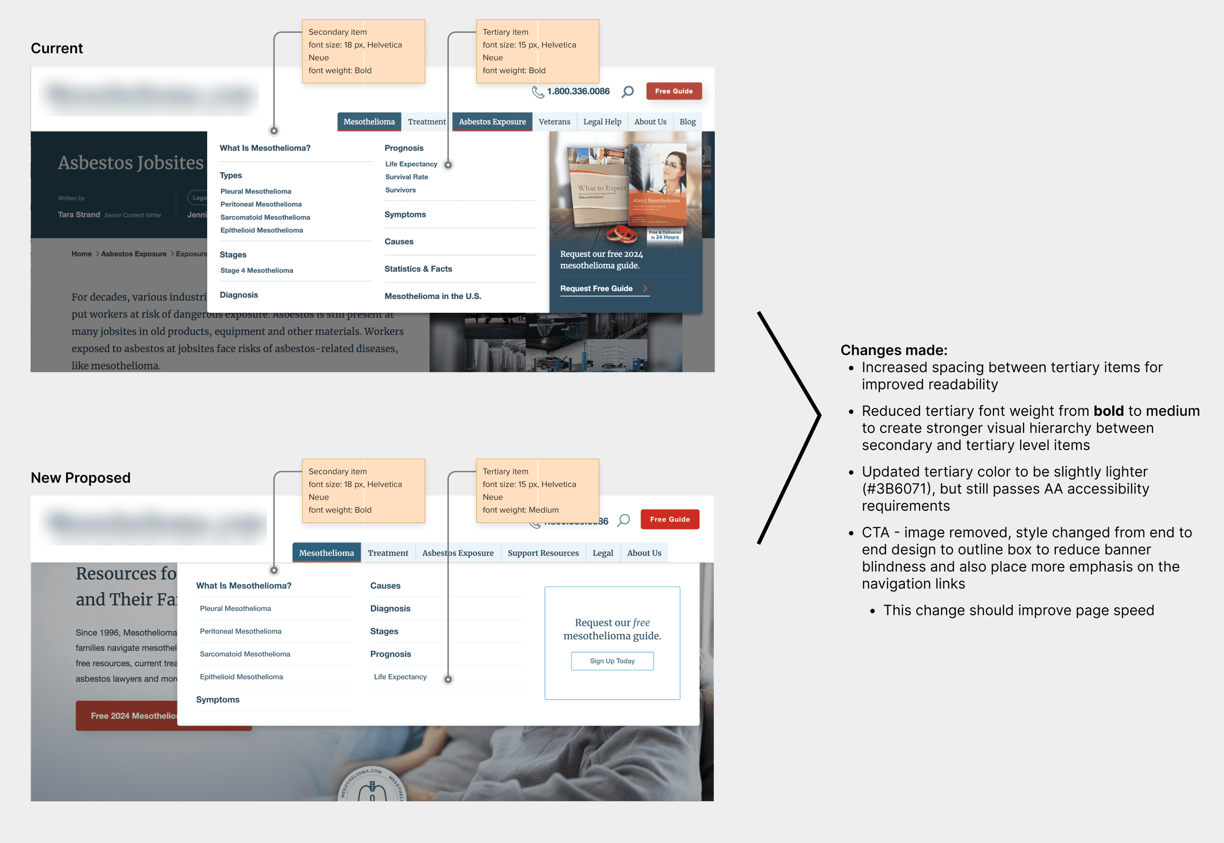
Card Sort Findings
- Respondents converged on the same six mental-model categories: Treatment, Support & Resources, About Cancer, Risk Factors, Legal Help, and About Us
- A meaningful share of participants independently proposed a dedicated Support or Resources category, even though nothing like it existed in the current navigation
- Caregivers and patients grouped content almost identically, so the new IA didn't need to fork by audience
- The number of primary categories people expected roughly matched what already existed; the real problem was one level down, where 57 secondary items had no clear hierarchy
To give the client confidence before committing to a full rollout, I built a pre/post analysis plan that benchmarked link clicks, bounce rate, and organic impressions on the pages most at risk, then proposed a phased rollout instead of a single cutover, so we could catch any negative signal early and roll it back before it became a bigger problem.
How I Influenced the Team
Research only mattered if it could withstand heavy client pushback. I grounded every recommendation in specific interview and card-sorting data, so decisions couldn't be dismissed as subjective. That shifted conversations from opinion to evidence and aligned both client stakeholders and our internal team.
Zoom reviews were slowing us down, with feedback filtered through layers of stakeholders and causing weeks of delay. I led an in-person workshop with executives, walking through the sitemap and updating the prototype live based on their input, which enabled real-time approvals instead of prolonged email chains. That single session unblocked more progress than months of remote reviews.
I also proposed a phased rollout with rollback plans for each stage, giving the client confidence to approve smaller, reversible steps rather than one large, high-risk launch.
Outcomes & Impact
The phased navigation rollout validated the approach with clear pre/post metrics: click-through to support resources rose 4.5%, and bounce rate on key pages fell 16.7%, showing users were finding what they needed more efficiently.
This improvement came without sacrificing organic search traffic. By integrating SEO from the start and throughout the phased rollout, we maintained rankings, meeting the client's core condition for approving any navigation changes.
- Reduced secondary navigation items by 47%
- Click-through rate to support resources up 4.5%
- Bounce rate down 16.7%, indicating stronger findability
- Updated visual design to improve content findability
- Rolled out in phases with SEO monitored throughout, protecting the organic traffic the client depended on